Graphic Design
A collection of graphic design projects exploring brand identity, visual systems, and design experimentation across freelance and independent work.
The Infinite Thread Book Series | 2025 - Ongoing
Brand Strategy & Visual Identity
This ongoing consulting project focuses on building a cohesive brand ecosystem for The Infinite Thread, a fantasy novel series by an emerging genre author. I was engaged to develop the foundational brand strategy—translating narrative themes, archetypes, and worldbuilding into a unified visual and storytelling system.
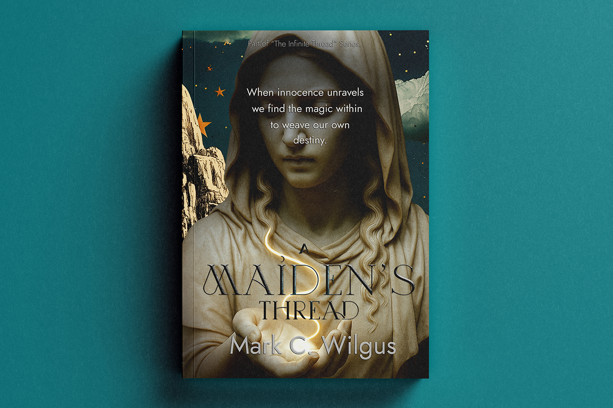
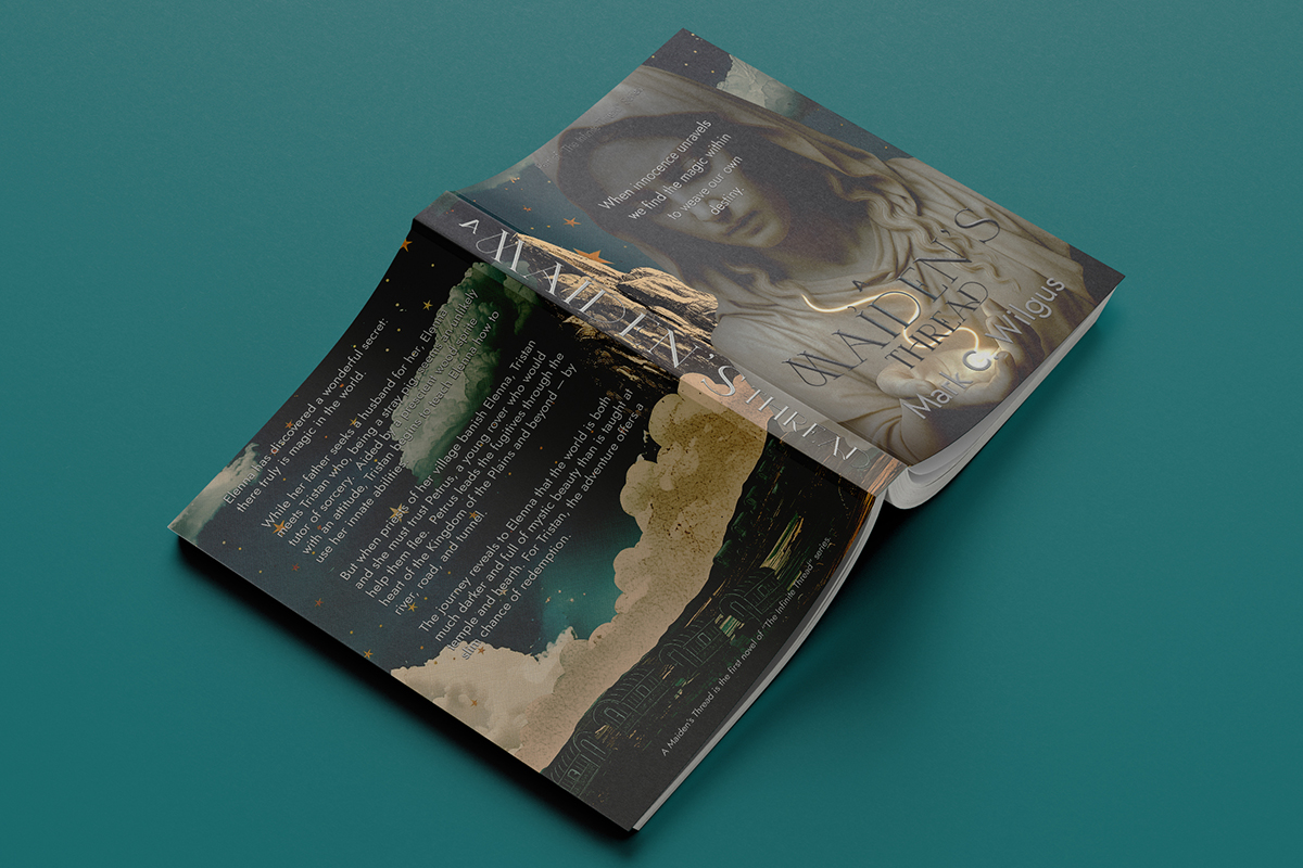
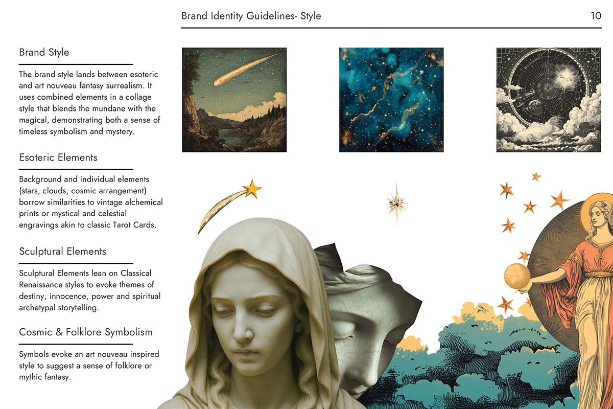
The debut cover for A Maiden’s Thread was created using a mixed-media design approach that blends 3D rendering, Photoshop compositing, and digital illustration. Drawing inspiration from esoteric symbolism, Art Nouveau ornamentation, and Renaissance sculpture, I developed a statue-based visual style that evokes mythology, magic, and timelessness. Sculptural elements were treated with layered textures, lighting, and atmospheric effects to create a sense of depth and mysticism—bridging classical imagery with contemporary fantasy design.
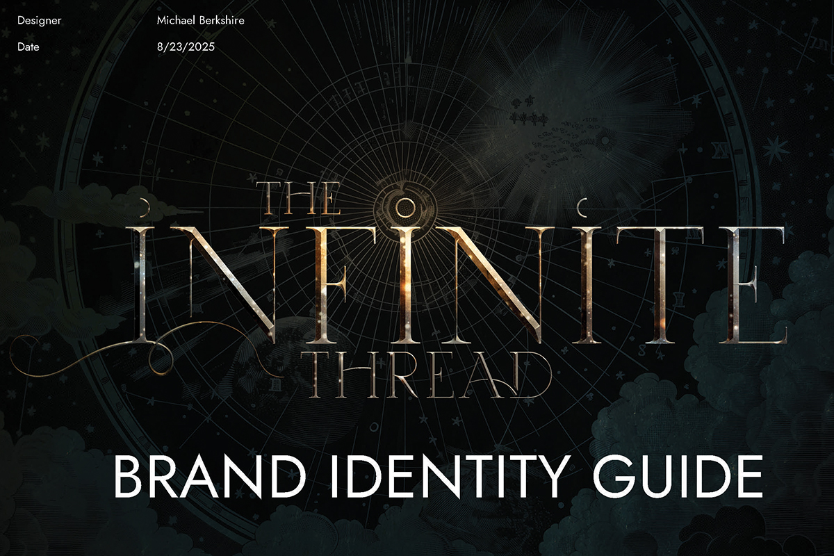
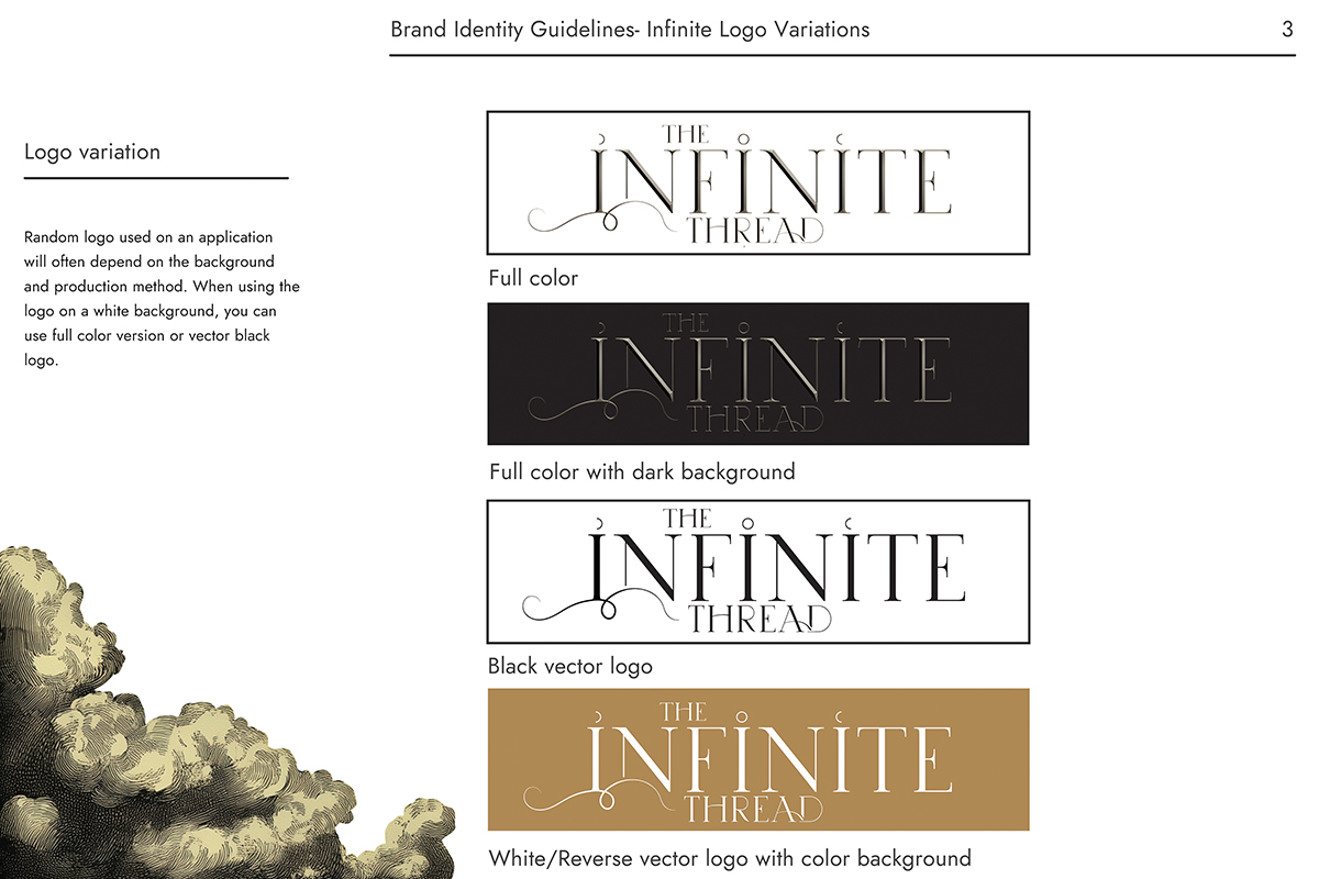
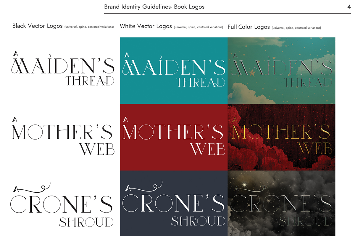
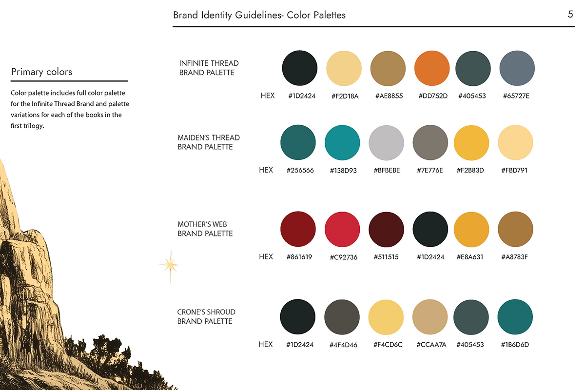
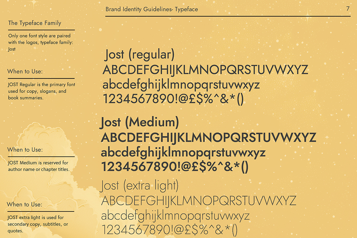
Beyond the initial cover, I designed the broader series identity, including logos, typographic systems, color palettes, and comprehensive brand and style guides to ensure consistency across future books and platforms. The engagement also extends into long-term strategy, including additional cover concepts for subsequent titles, social media launch planning, and a website rebuild to support audience growth.
Together, this work establishes a scalable visual and strategic framework—positioning The Infinite Thread not just as a single novel, but as a fully realized fantasy property designed for expansion.
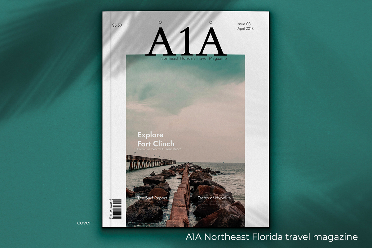
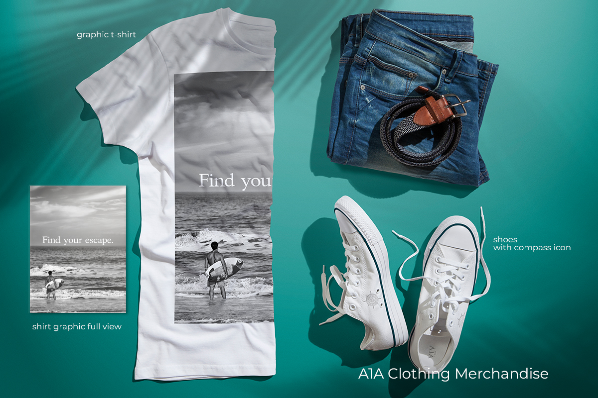
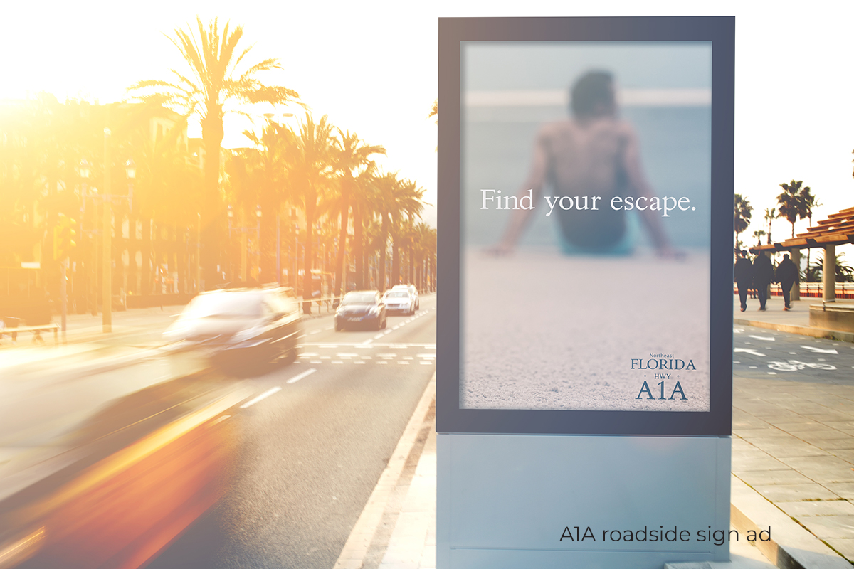
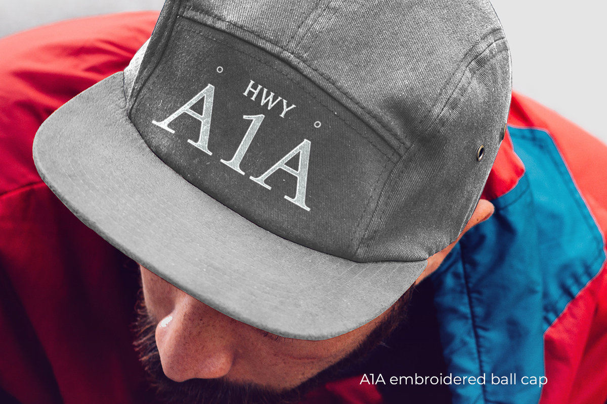
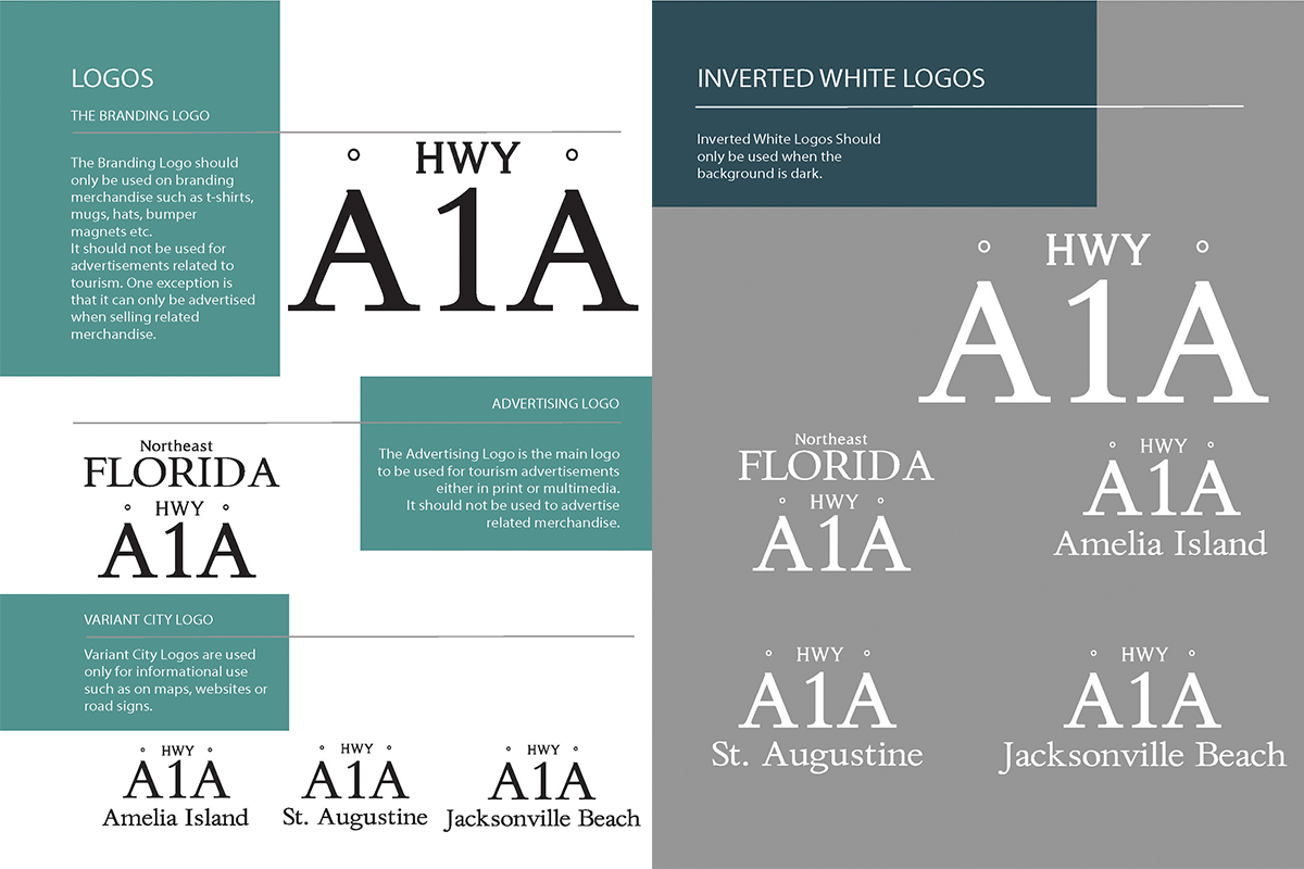
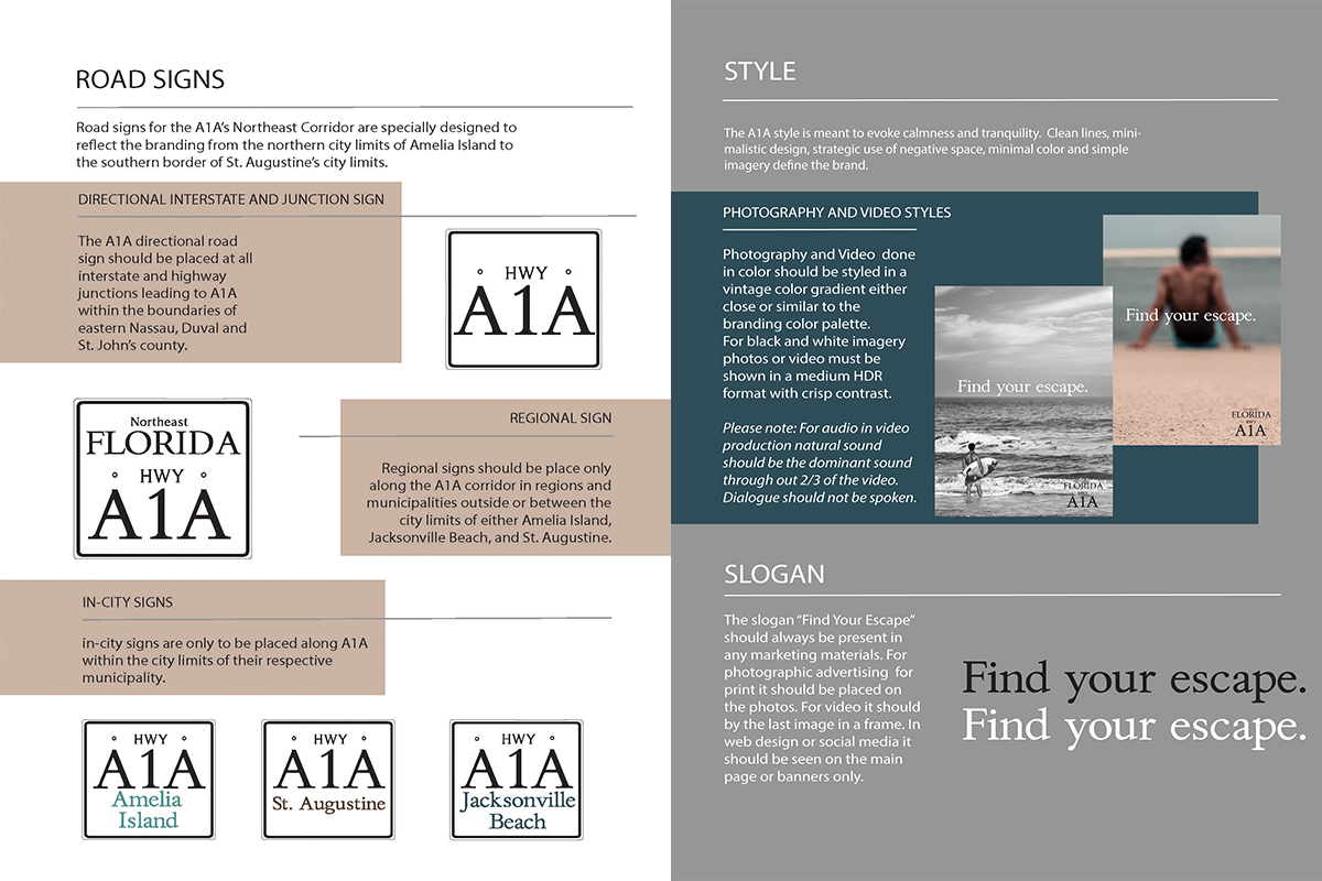
Highway A1A Northeast Florida | 2018
Regional Brand Concept
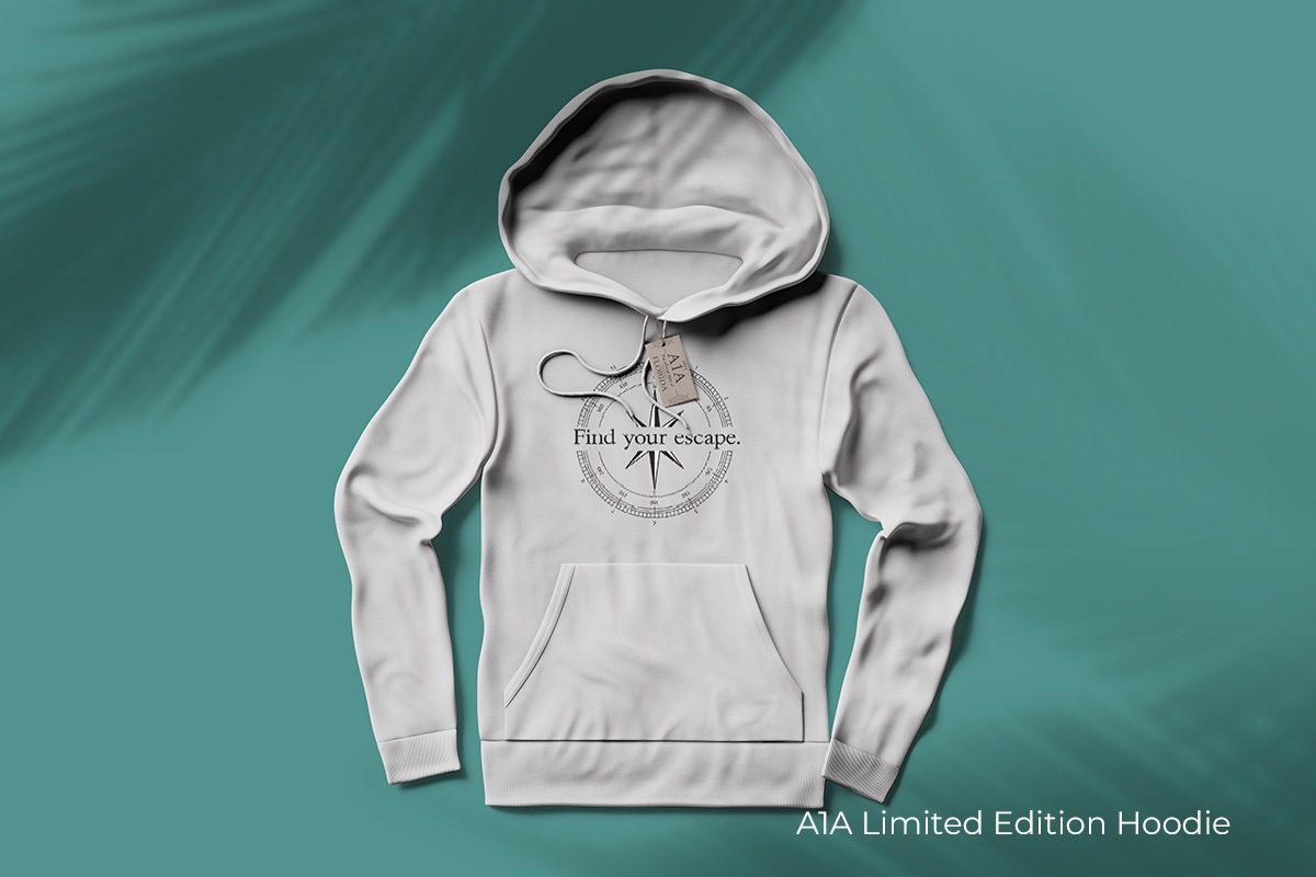
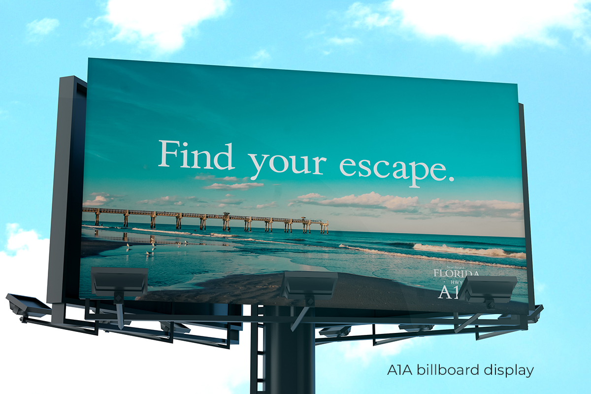
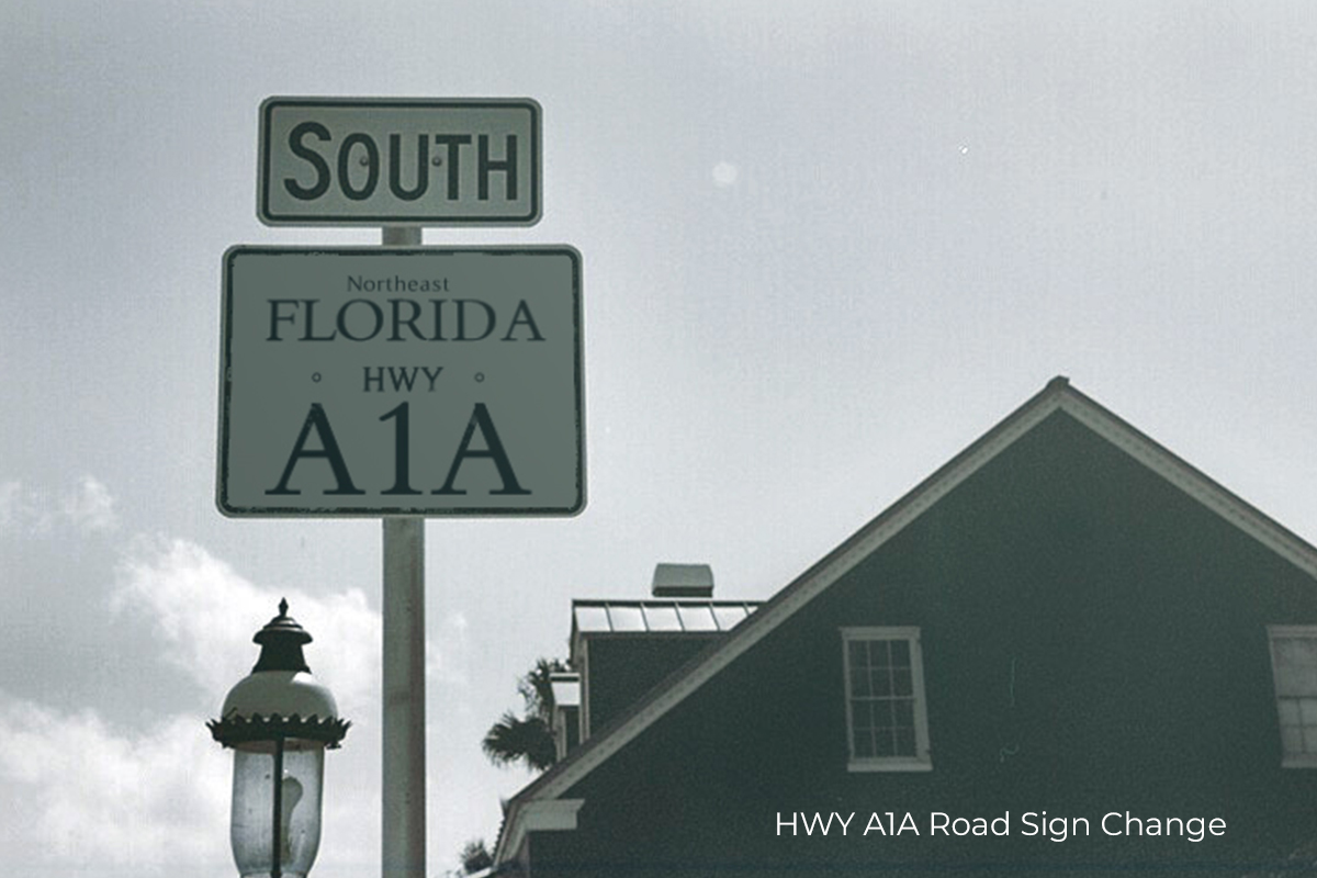
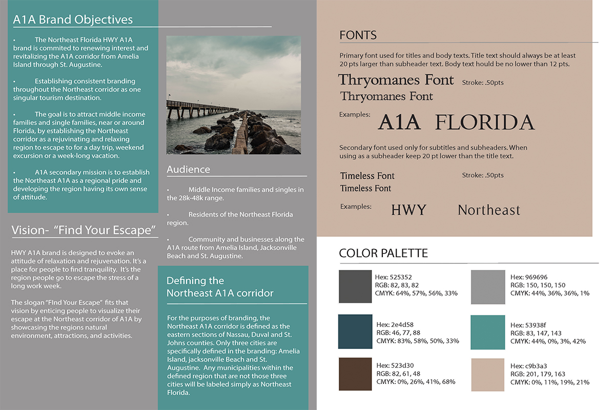
The Highway A1A project was a conceptual regional rebrand exploring how design and content can shape place-based identity and audience perception. Focused on the Northeast Florida coastline from Amelia Island to St. Augustine, the brand positioned the corridor as a distinct weekend destination for locals in the Florida–Georgia region, emphasizing coastal culture, ease, and regional pride. I approached the project as a full brand system—developing concepts for lifestyle merchandise, a travel magazine, a billboard campaign, and a proposed redesign of A1A highway signage to create a unified regional identity. To test how the brand could live beyond static design, I also launched a prototype Instagram account to explore tone, visual direction, and content themes, demonstrating how the identity could translate into an ongoing social presence and broader content ecosystem.
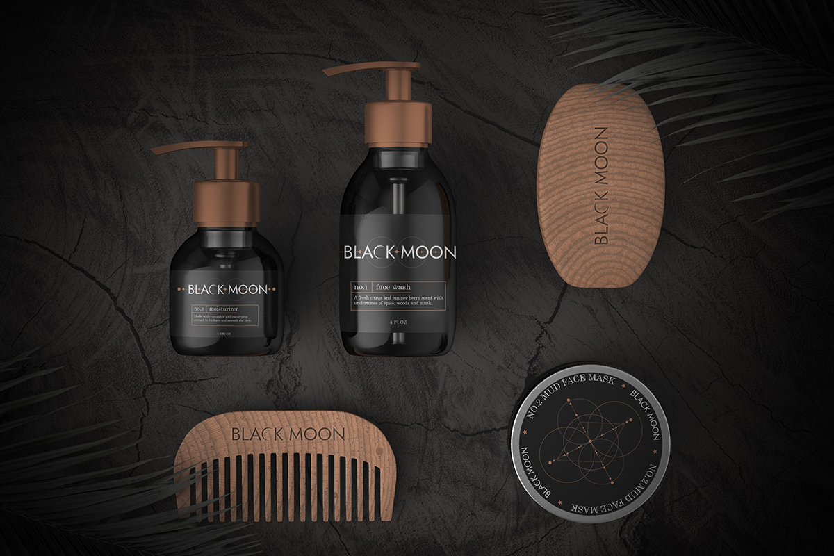
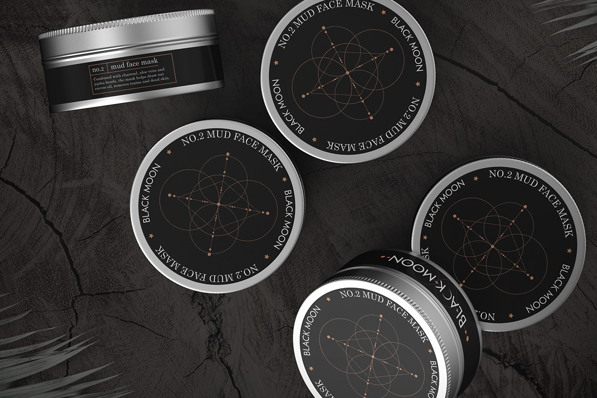
Black Moon Skin Care| 2020
Product Brand Identity
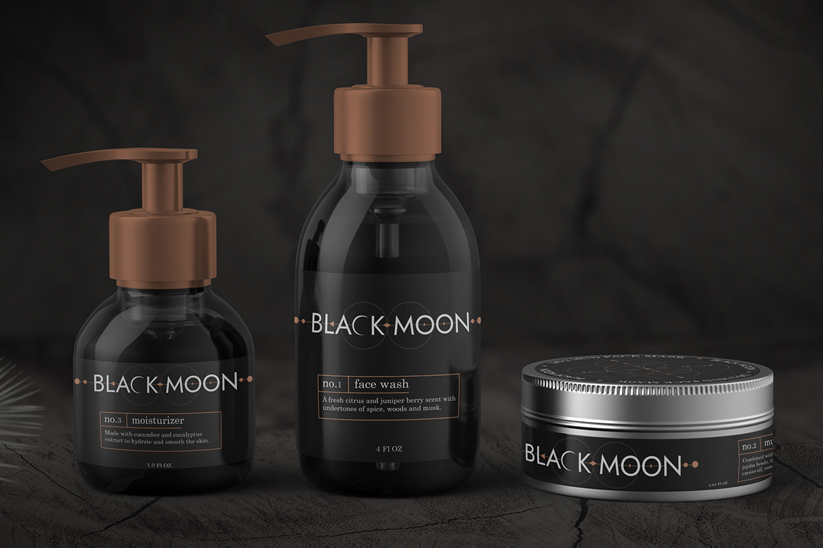
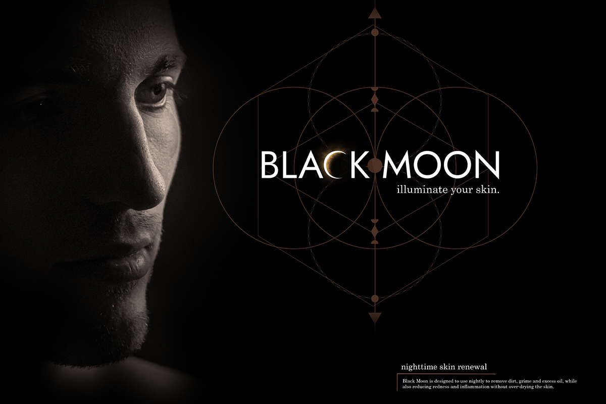
Black Moon was an independent branding project centered on positioning a skincare line for individuals seeking simplicity over complexity. Designed for users overwhelmed by multi-step routines, the brand focused on clarity, ease, and everyday self-care. The name Black Moon draws on the symbolism of renewal and transformation, informing a visual identity rooted in minimalism and restraint. Through intentional typography, subdued color palettes, and a calm visual system, the brand reflects a promise of effortless skincare while demonstrating how thoughtful design can reinforce product philosophy, audience needs, and brand positioning.
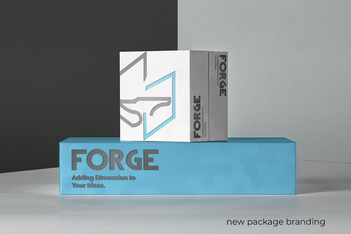
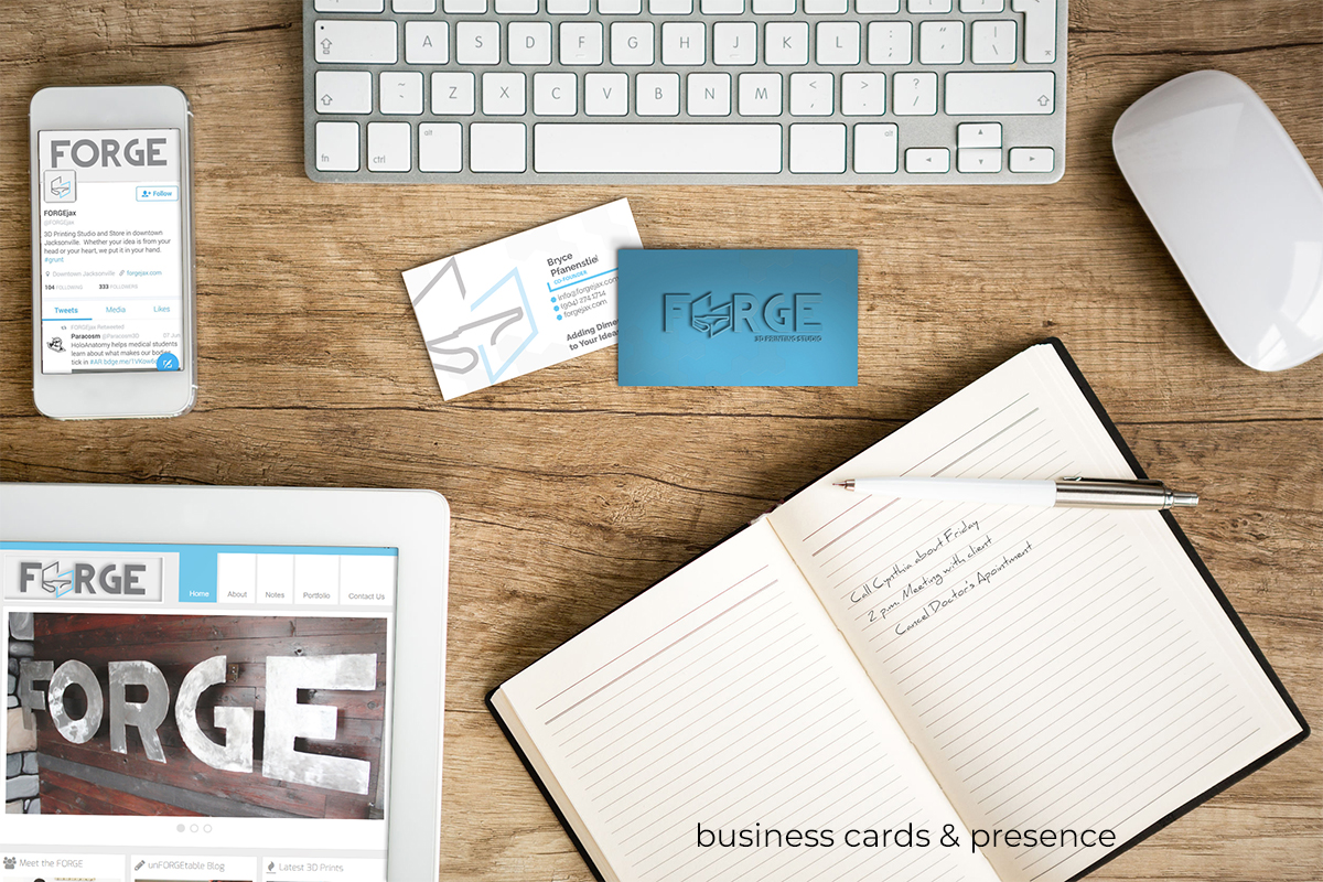
Forge 3D Print Studio | 2016
Logo Refresh
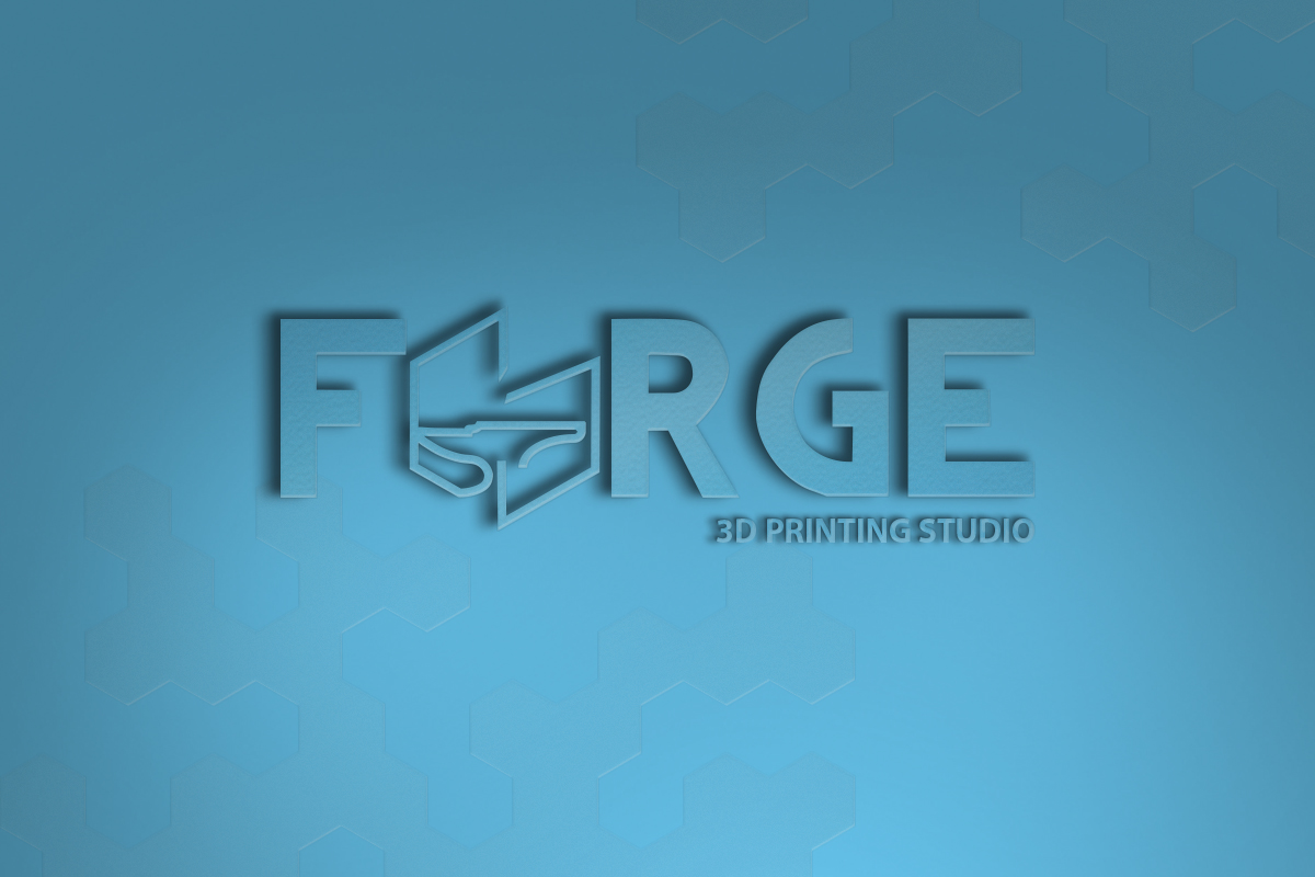
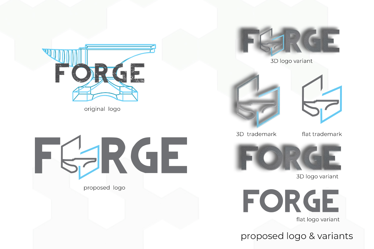
Forge 3D Print Studio was a Jacksonville-based 3D print shop whose original logo featured an anvil illustrated in a blueprint style. While the concept was strong, the rasterized linework lost clarity at smaller sizes, limiting its effectiveness across applications. I proposed a refreshed identity that preserved the recognizable anvil symbol while reimagining it as a clean, scalable vector mark. The redesigned logo was integrated into the company name and developed to function both as a primary lockup and a standalone icon. Although the proposal was not ultimately adopted, the project included mockups for business cards, social media branding, and product packaging—demonstrating a cohesive visual system designed for clarity, flexibility, and long-term brand usability.
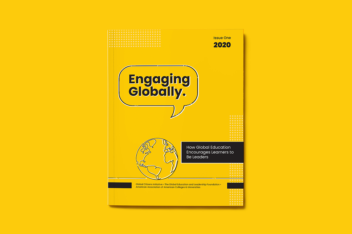
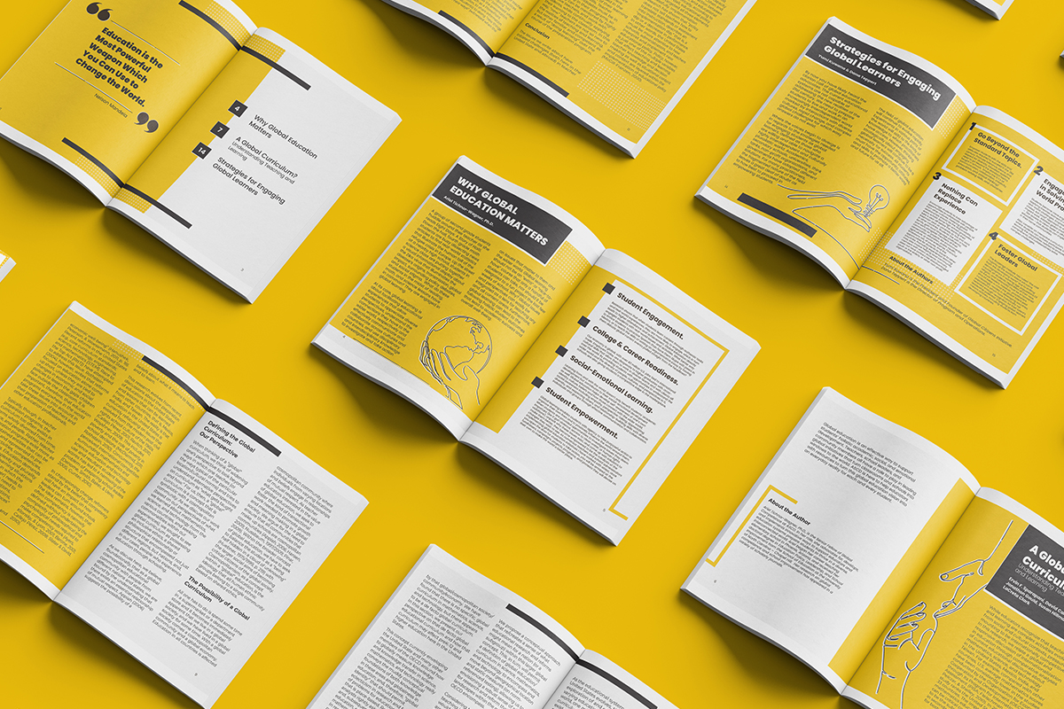
Engaging Globally | 2020
Editorial Design
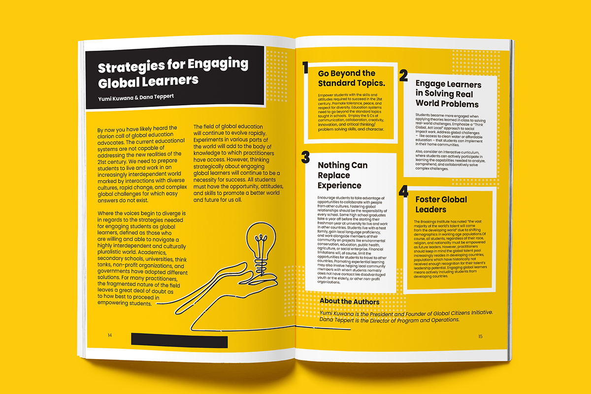
Engaging Globally was a design project focused on translating complex academic research into an accessible, educator-facing resource. Recognizing that global education initiatives can feel overwhelming, I synthesized insights from three scholarly articles and reframed them through a clear narrative structure and simplified visual system. The resulting piece was designed to be easily read, referenced, and shared—demonstrating how graphic design can function as a strategic tool for knowledge translation, audience engagement, and practical application within higher education contexts.
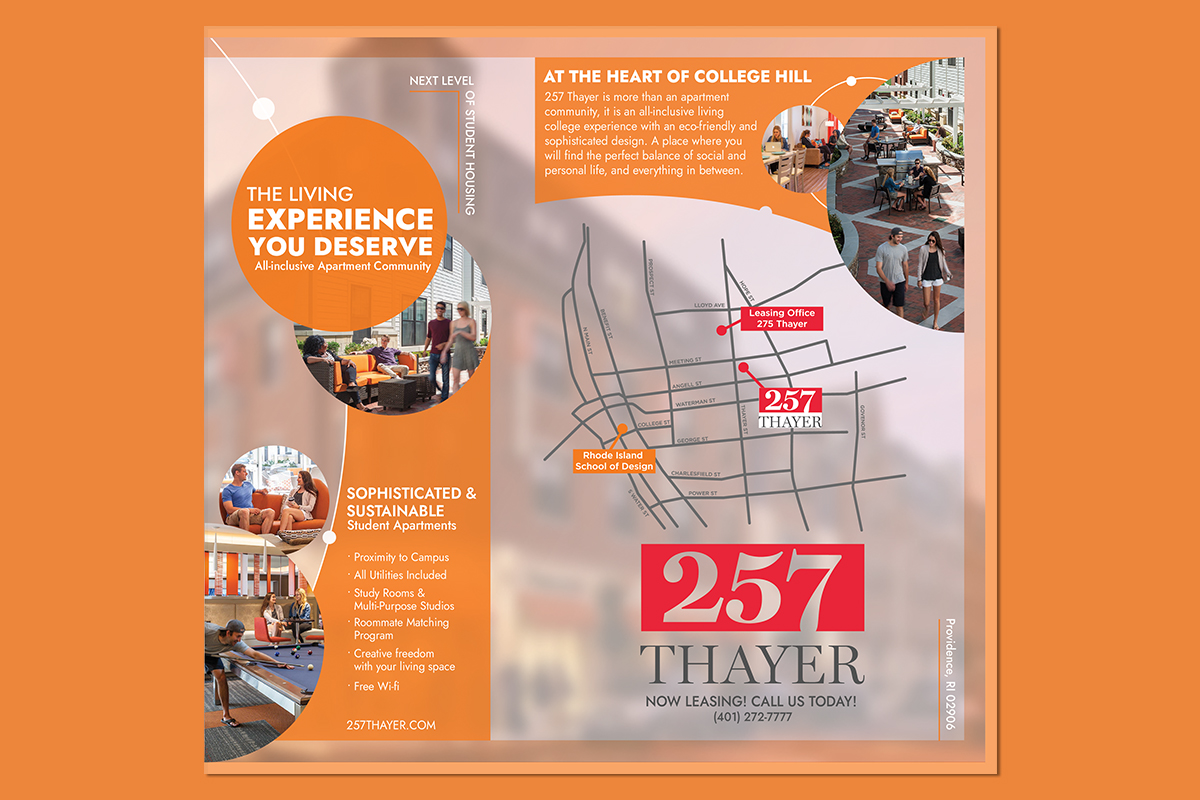
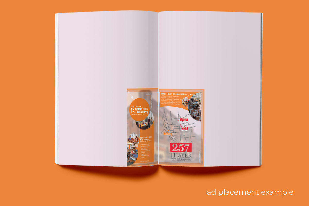
256 Thayer Apartments | 2020
Client Ad Design
256 Thayer Apartments was a freelance graphic design project developed in collaboration with a creative advertising agency for a student apartment complex in Rhode Island. Working within strict constraints—including a compact 1.5-inch ad size, a pre-designed map, and existing brand assets—I focused on clarity, hierarchy, and visual impact at small scale. The design aligned with the color palette associated with Rhode Island School of Design, ensuring relevance to the target student audience while maintaining brand cohesion. The final piece was designed to stand out within a multi-page magazine spread, demonstrating how thoughtful composition and strategic restraint can drive visibility even in highly limited formats.
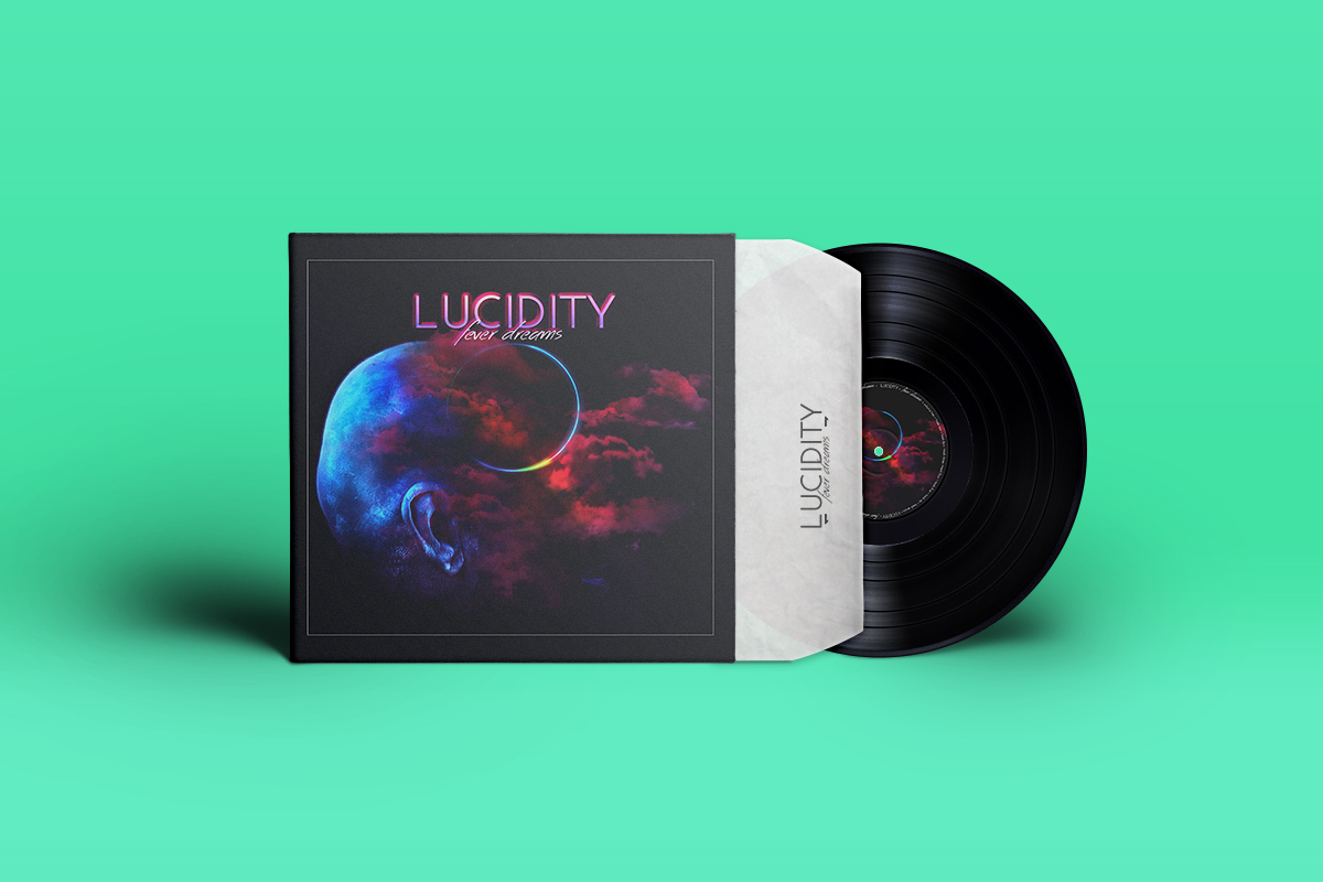
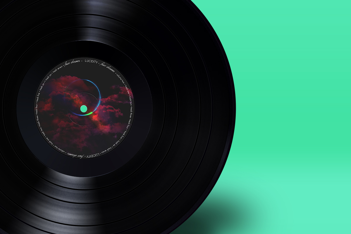
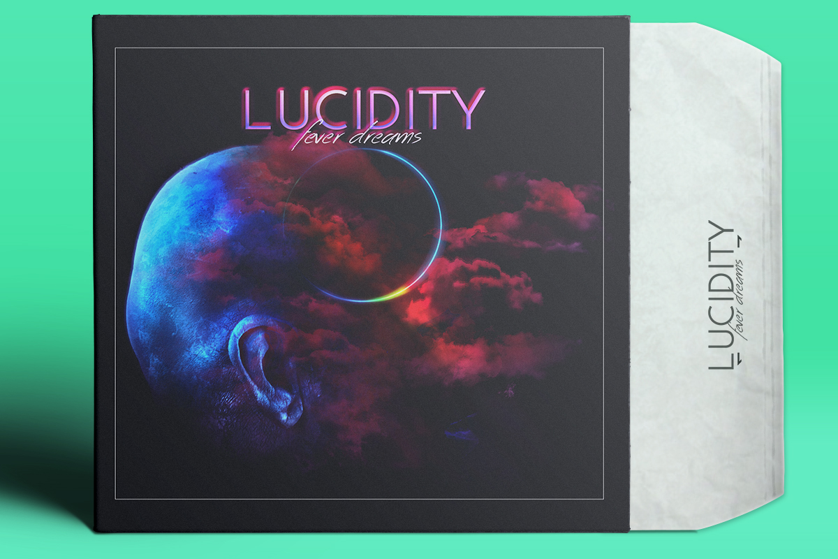
Lucidity | 2017
Album Art Concept
For this independent project, I designed an album cover concept for the EDM/Trance music genre. Inspired by the hypnotic, immersive qualities of Trance music, I developed a surreal, dream-like visual style to reflect the emotional and sensory experience of the dancefloor. The imagery blends abstract and atmospheric elements to evoke movement, rhythm, and altered states—capturing the essence of the genre through visual storytelling.
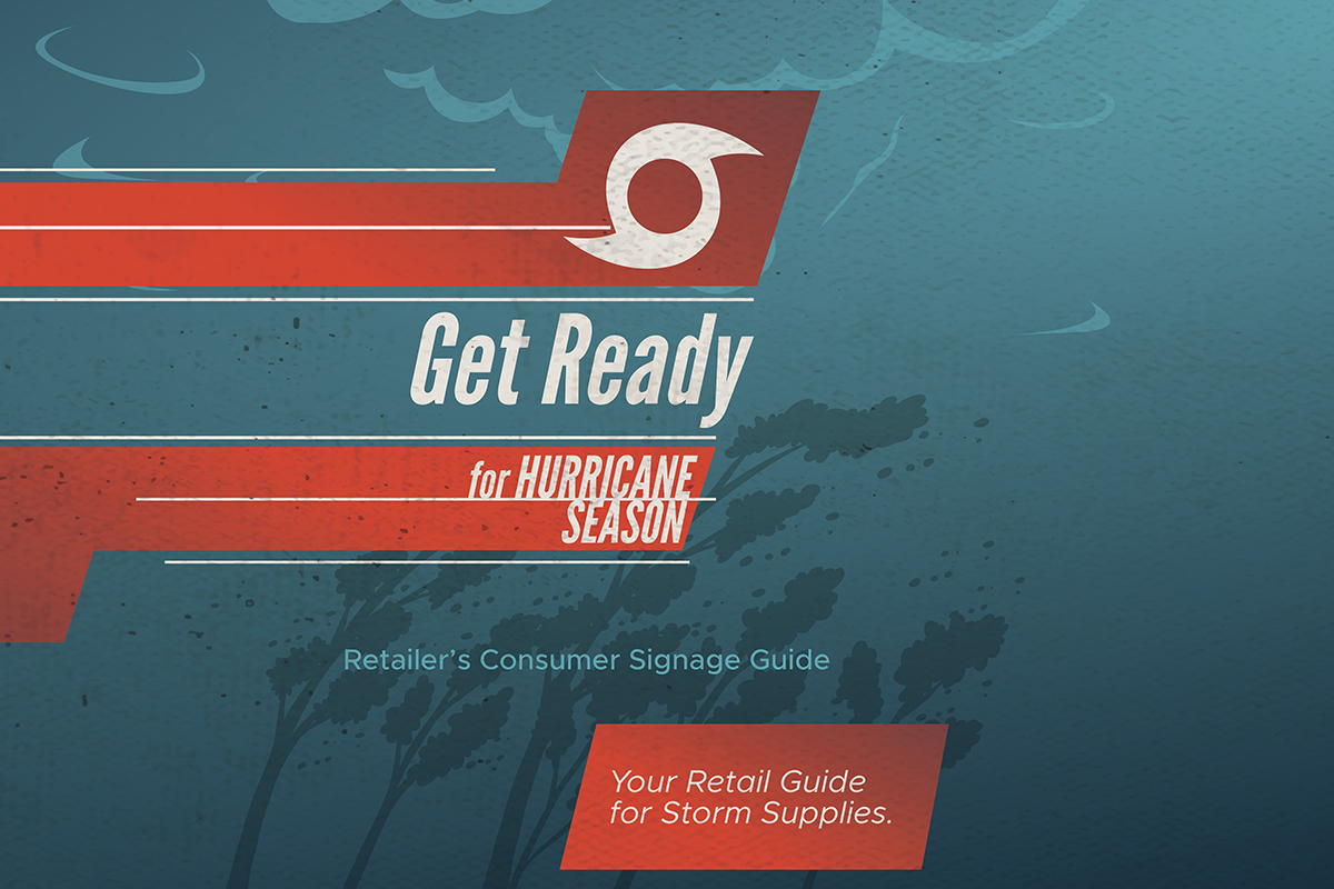
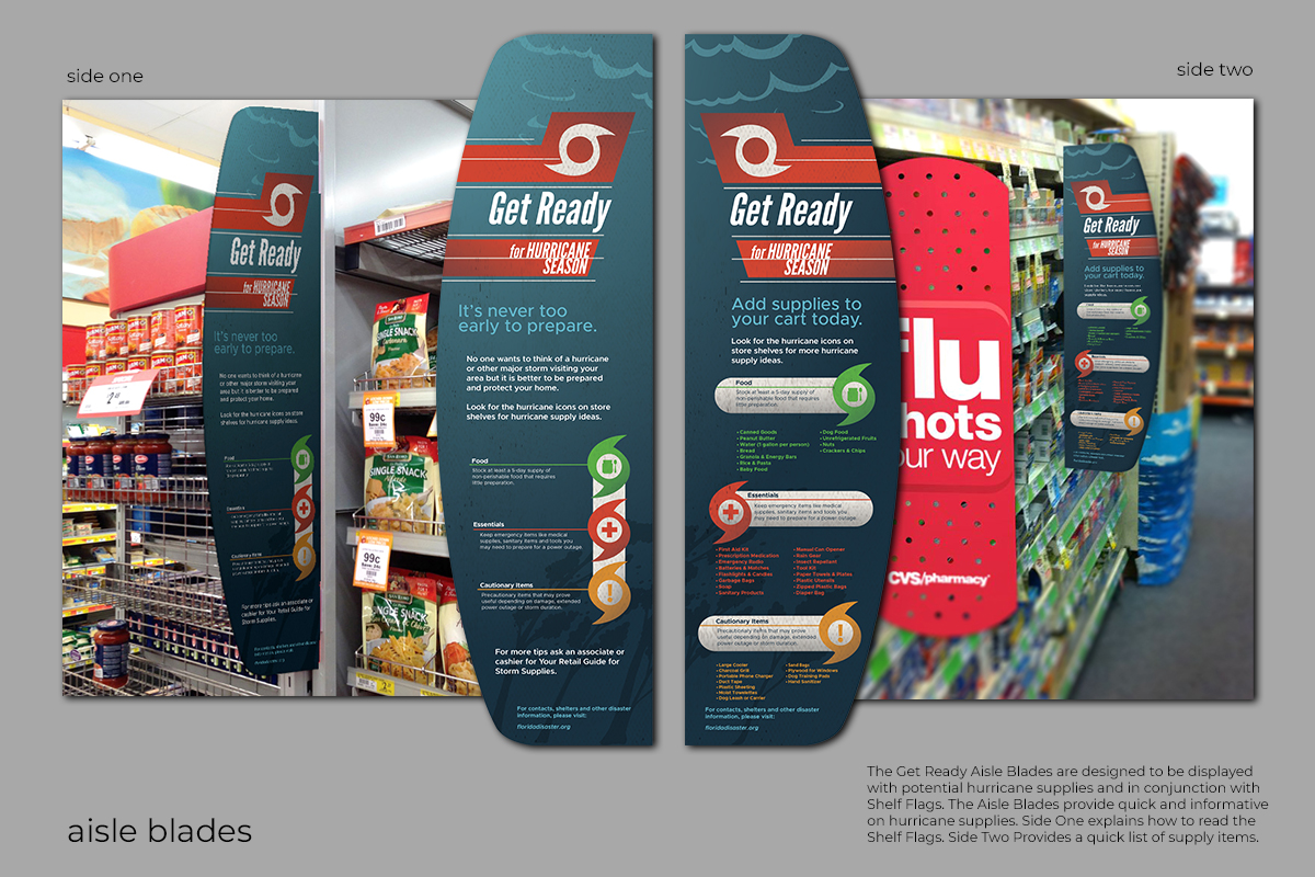
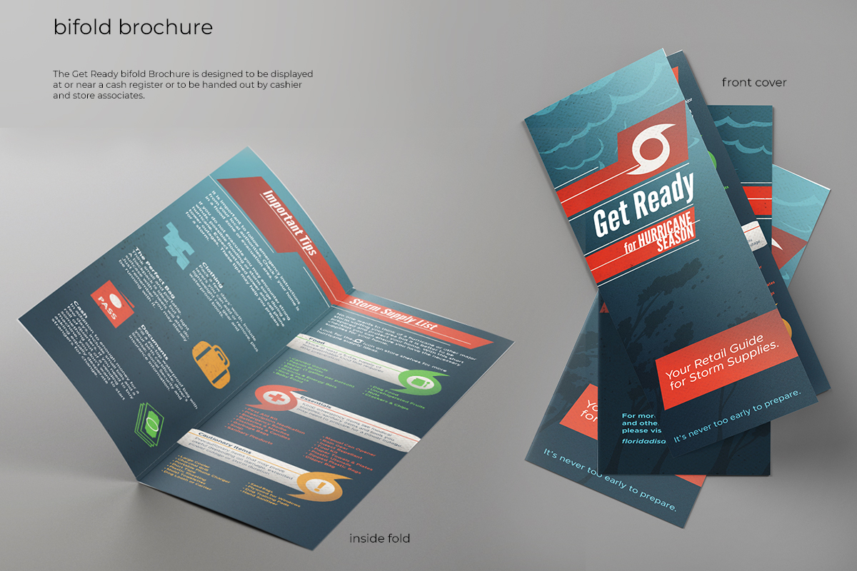
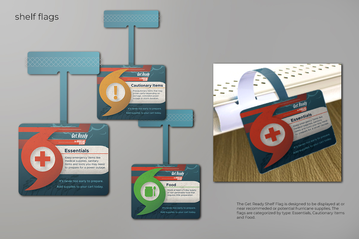
Get Ready | 2019
Retail Campaign System
Get Ready was a retail-focused communication and design project developed to support Florida retailers during hurricane season. Drawing on my background in retail environments, I designed a supply guide and in-store signage system that encouraged shoppers to prepare for emergencies during routine visits while increasing visibility for key merchandise. The campaign included icon-based shelf tags identifying hurricane-related items, aisle blades featuring preparedness tips and a clear icon legend, and a supporting brochure for wider distribution. Designed as a cohesive visual system, the project demonstrates how graphic design can guide consumer behavior, simplify complex information, and support both public safety messaging and retail performance.